
Like so many, I picked up a Fitbit last month. I thought it would be a fun way to gain some insight into my activity and help me stay a little more active. Generally, I really like the little fella, though my activity has been hampered by a round of flu in the household, a few very cold weeks of wintertime weather, and a lot of busy, long days. (I wonder what activity best represents using a standing desk; Fitbit seems to think I’m mostly lethargic during the work day, but I think I should get some points for standing there.)
Fitbit offers a premium tier that provides extra reports and the ability to download one’s data for $50 per year. I’m not particularly interested in most of the features that come with premium membership, but I am a data guy, so the Fitbit API offers, albeit with some work, a way to get my data out of their system.
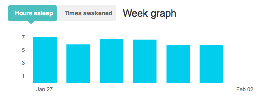
Working directly with the data yields plenty of benefits. Currently the charts on the fitbit web site all require Flash, so as a Click to Flash user I have a lot of clicking to do, all to view a relatively simple bar plot that doesn’t tell me that much. Sleep is a great example. The built-in chart of sleep at Fitbit doesn’t offer much information, and all its variants are simply more bar plots. There’s a nightly activity chart that shows times awake or stirring, but not a view that compares that activity against other nights or shows relative sleep-wake times.
Well, we can fix that.
I’m using the Fitbit plugin from Slogger, modified to run by itself on a server and grab my daily data. It saves the data I’m looking for, via the Fitbit API, to a text file that I can grab and process with R and ggplot2 to make some more useful and attractive plots for myself. Here’s what I’ve come up with for sleep.
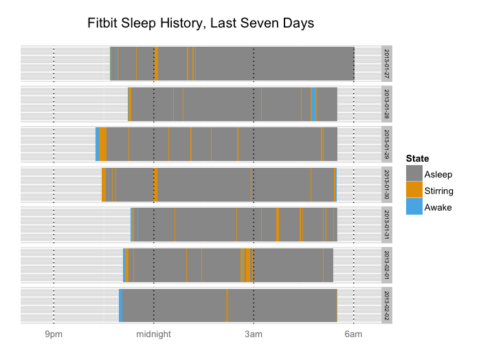
There’s a lot more data here, in what I think is a much more interesting and attractive visualization: Relative times to sleep and wake, plus display of two variants of nighttime activity, fully awake and partially awake or stirring. (The Fitbit nightly graph shows them as a single category of wakefulness). Unlike the built-in graphic, this one shows comparative times across days, which is particularly useful for figuring out just why I’m dragging my feet so much this morning – of course, it’s because I’ve been up by 5:30 at the latest all week while pushing my bedtime further and further from its sweet spot.
Additional refinements might include adding the total sleep time to each bar, for more easy to read comparison. (This is basically all you get from the over-time graph that Fitbit provides by default.)
Data is fun and the programming, for both the data extraction via API and the manipulation and plotting in R, is enjoyable learning and pastime for me. I’ll continue to play with the Fitbit activity data for steps and overall activity and see what else I can come up with.