My little Shiny app to visualize my last.fm data continues to tick along. This graphic shows the top artists of my year not in my top all-time played list. My favorite new album of 2024 is at the top of this list: Nick Cave’s WILD GOD is a tremendous, moving record.
If you’re still scrobbling, you can see your own data at deardestiny.shinyapps.io/tuner.

Apple, I’m practically begging you to implement a multi-select editor in the viewer for activity data. When the Peloton app on my watch goes haywire and decides that I’m exercising from midnight to 3am – reader, I was not exercising – it would be nice to be able to selectively delete all those records instead of nuking the entire day.


I’m starting on some of my end of year data projects. First up, a bit of output from the summary visuals I’m building of my workout data! I know, I know, polar plots are bad data representations, but I really like the clock-like image for this depiction of workout times.

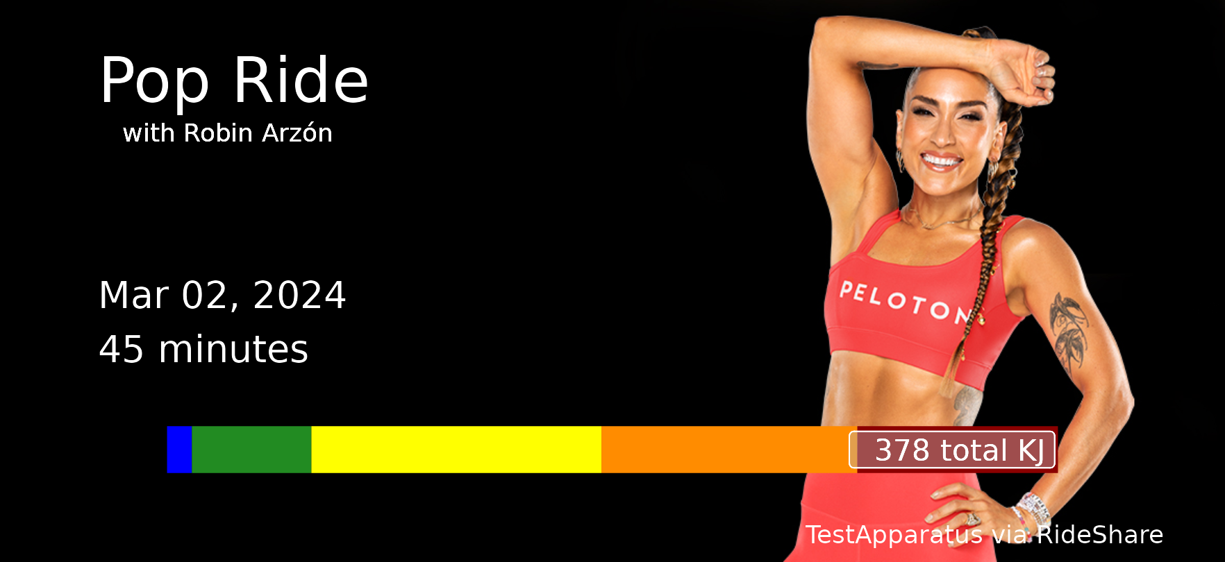
I hit this Turkey Burn ride pretty hard this morning and am resting deep in post-ride endorphins, now. Time to sip on my coffee and think on some thanks. I’m glad I get to do this.

Got in a solid ride first thing this morning, plus some cool-down time and stretches. I’m sitting now with the endorphins and calm that come in after a hard workout, appreciating the quiet and still after furiously working in my body.

The week is almost here! I’m giving a talk at posit::conf(2024) about some of the challenges leading a data science team. Am I ready? I will be! I’m looking forward to meeting and learning throughout the week.

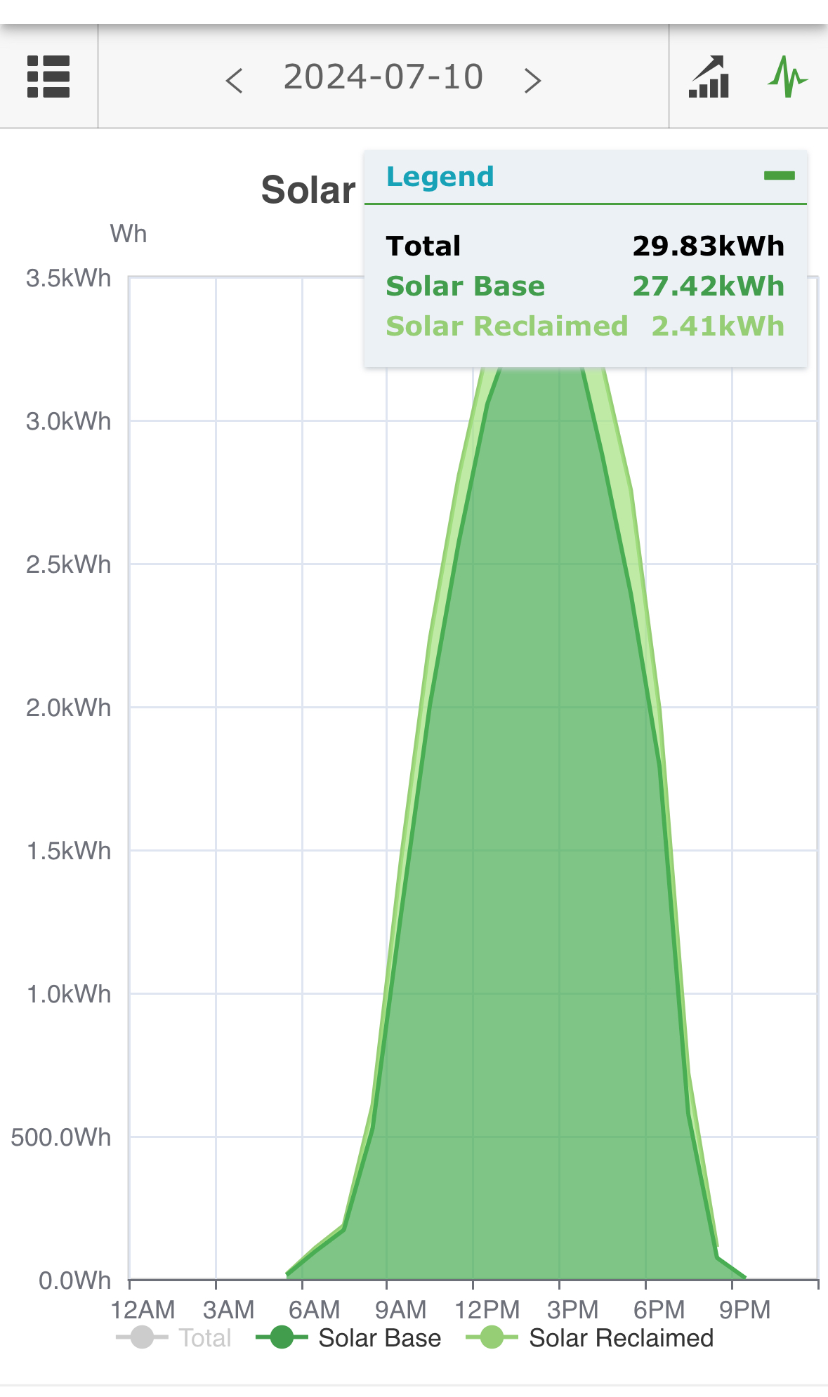
We’ve been in our place for a couple of months before finding that the solar system wasn’t producing any power. One quick visit from a tech and we are making energy from the sky. Yesterday’s production was a little less than twice our monthly average in the previous billing period. I am STOKED.
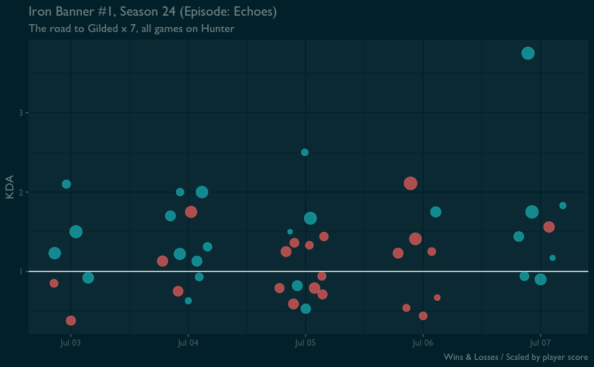
I had a pretty good time getting to the gilded title again in this week’s Iron Banner, the first of this newest The Final Shape expansion.
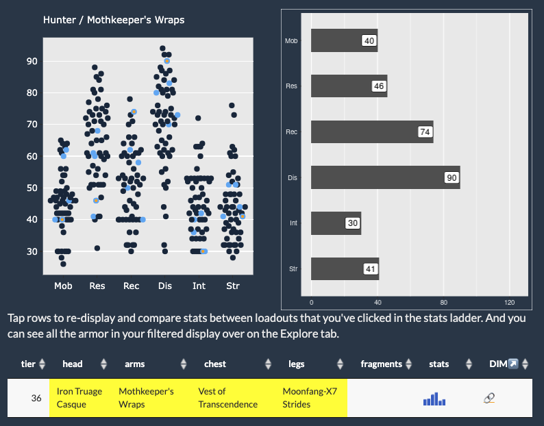
With the release of the tremendously good The Final Shape expansion, I’m in the mood to make some updates to my Destiny 2 tools. First up is Armorer, with a re-work of some filtering options to limit possible loadouts by tier, which seems to get right to an effective loadout more quickly than my prior approach. It’s a little limited, but I really like the direction this allows me to go. And it’s fun to work on again!